Input Clarity
The primary action needed to be immediately understandable so users could shorten a URL without having to figure out how the interface worked.
A clean, focused URL-shortening experience designed around simplicity, clarity and a fast path from long URL to short link.
UI/UX × Development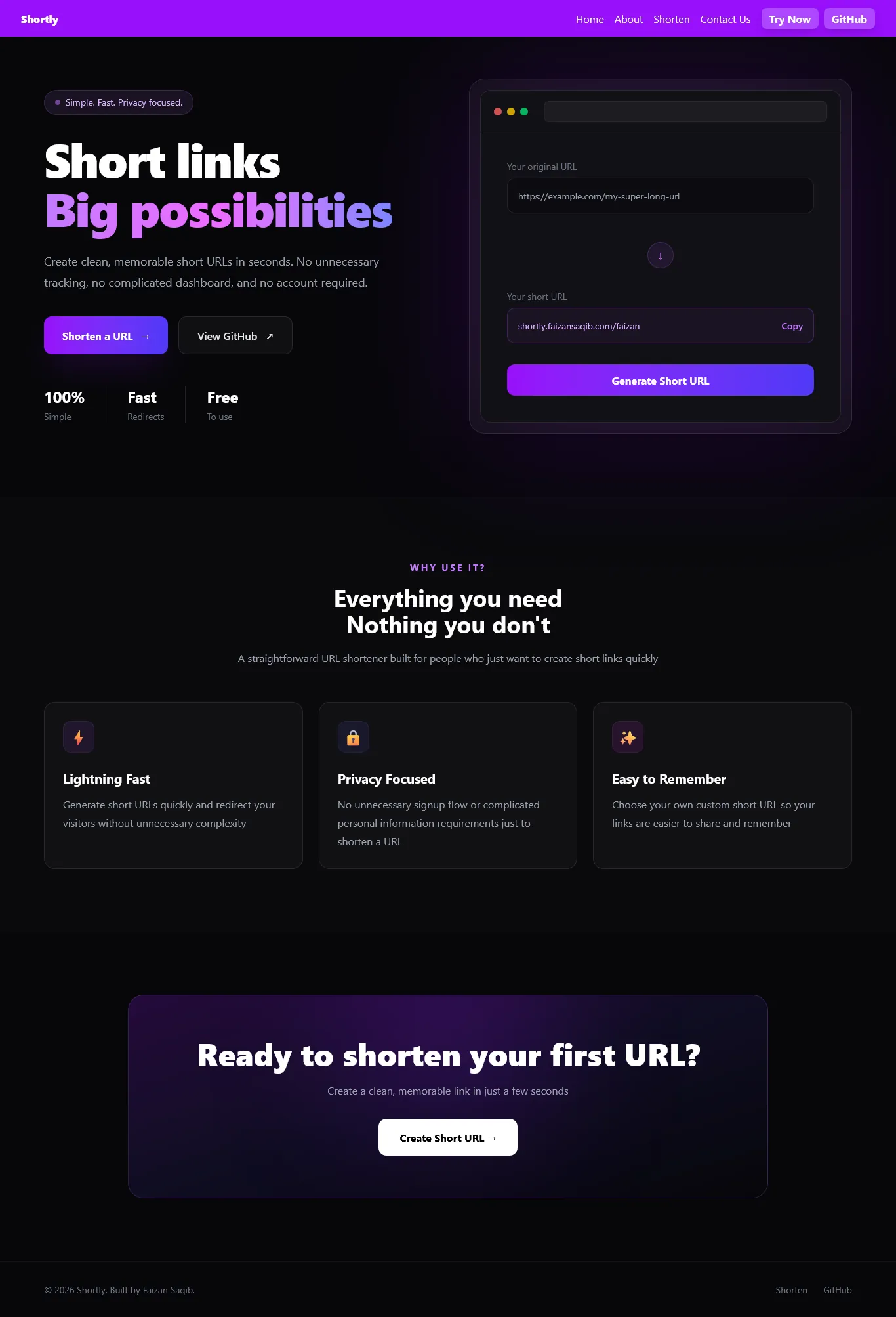
Role
UI/UX Designer + Developer
Type
URL Shortener
Platform
Web Application
Work
Design + Development
Shortly is a focused URL-shortening experience designed to make one task feel effortless: turning a long URL into a short, usable link.
The interface was designed around clarity rather than unnecessary complexity. The main action stays visible, navigation remains minimal and the shortening flow is easy to understand from the first interaction.
Visit Shortly↗The primary action needed to be immediately understandable so users could shorten a URL without having to figure out how the interface worked.
The interface needed a strong visual hierarchy that kept the URL input and shortening action as the clear focal point.
Once a URL was shortened, the resulting link needed to be presented clearly without making the experience feel complicated.
The experience had to remain simple and usable across desktop, tablet and mobile screen sizes.
A focused interface built around one primary action.
Clear hierarchy between the URL input, action and result.
A dedicated shorten experience that keeps the workflow simple.
A minimal navigation system that avoids unnecessary distractions.
Responsive layouts designed around the actual user flow.
A consistent visual system carried across every interaction.
Defined the core user journey and reduced the experience to its most important interaction: entering and shortening a URL.
Built the interface around a strong typographic hierarchy, simple spacing and a focused visual language.
Translated the interface into a responsive web application with reusable components and a clean implementation.
Polished spacing, states, responsiveness and interactions to make the final experience feel intentional.
The homepage is designed to immediately communicate the product and place the main URL-shortening interaction at the center of the experience.
The shortening experience keeps the user focused on a single task. Enter the URL, trigger the action and receive the shortened result without unnecessary steps.
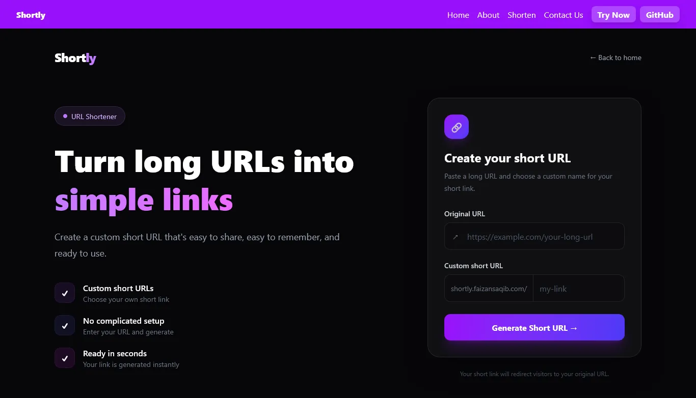
The user starts by entering the long URL they want to shorten.
The primary action processes the URL and creates the shortened link.
The shortened URL is presented as the final result of the workflow.
Shortly was built with the same principles used during the design phase: clarity, responsiveness and a focused user experience.
Component-based frontend architecture with responsive layouts and reusable UI.
A utility-first styling system used to keep the visual system consistent throughout the application.
The product keeps the primary task obvious from the moment a user lands on the page.
The interface avoids unnecessary elements and keeps attention on creating a shortened URL.
The experience is structured to adapt cleanly across different screen sizes.
A URL shortener does not need a complicated interface. Removing unnecessary elements made the core action stronger.
The experience is not only about the initial input. The result state is equally important because it completes the user's task.
Building the interface while thinking about implementation helped keep the final product practical and consistent.